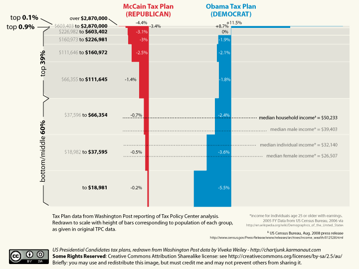
The other chart out there makes the increase for 0.1% of the population look as big as the cut for the bottom 20. This shows how the cuts break down relative to how many people get them.
Sorry...Find your income bracket on the left, then look to the right to see how much your taxes would get cut under Obama or McCain. The blocks to the left indicate a cut, blocks to the right an increase. The chart is drawn to show what percentage of people would be getting each cut. But like downhill said, its missing a lot of important details.CiscoKid wrote:What am I looking at? Some explanation of the chart would be helpful